Political parties in the U.S. historically identified with distinct colors: Republicans associated with red and Democrats with blue. However, this wasn't a constant trend throughout history.
Behind a dedicated Election Desk at CNN's Atlanta studio, the technology wasn't exactly enchanting (at one point, a producer could be seen adjusting the map manually behind the hosts, facing away from the camera). However, as the results rolled in, the undeclared states started changing color, one by one, until Republican presidential nominee Ronald Reagan's substantial victory over incumbent Jimmy Carter transformed the map's predominantly orange color... into a sea of... blue.
On NBC that particular night, newscaster David Brinkley cracked a joke about the western part of his network's Republican-dominant map turning so blue, it seemed like a suburban backyard swimming pool was expanding. Meanwhile, Walter Cronkite informed CBS viewers that "the United States appears to be strikingly red, white, and blue... but predominantly blue, tonight."
Today, the perception that Republicans are associated with red and Democrats with blue might seem like an ingrained element of US politics, with phrases like "blue states" and "red states" echoing throughout. But this association was only truly solidified in the public consciousness following the 2000 US presidential race between George W. Bush and Al Gore.
Before the turn of the millennium, the situation was the other way around. The color scheme would vary depending on where one obtained their news, and some outlets would switch up their color-coding between elections.
On that night in 1980, for instance, ABC was the exception, displaying the Republicans as red while they had used yellow for the party four years earlier. During ABC's 1984 election coverage, Brinkley, now reporting for ABC, offered an off-the-cuff explanation for this change: "Red, R, Reagan – that's why we chose red."
Colorful background
The GOP's ties to the color blue extend far back in history. It's an association which can arguably be traced back to the American Civil War, when Abraham Lincoln's Union Army was often recognized by its dark blue uniforms, as opposed to the gray usually associated with the Confederate's military.
The shade was also deliberately employed by the Republican Party in the 20th century. Since the 1970s, as campaign branding grew more sophisticated, the majority of Republican logos have tended towards blue. During a Republican headquarters event in Washington DC in 1984, a massive back wall map was unveiled, where organizers removed green covers from each state to reveal sparkly blue fabric for the 49 states announcing support for Reagan.
Often linked with wealth and conservatism, blue has historically been one of the priciest colors to produce. Red, on the other hand, has long been associated with radicalism.
Red appears on the flags, logos, and ensigns of left-leaning political organizations, from radical communists (such as "Red China") to European social democratic parties, Canada, and Australia. The earliest electoral maps, like Scribner's 1883 Statistical Atlas of the United States, followed a red-for-Democrat, blue-for-Republican scheme that would have been familiar to political observers outside of the US.
Nevertheless, neither party has had an official color. And up until the 1970s, election news was broadcast in black and white, while newspapers predominantly used monochrome printing, making contrast a more significant concern than color.
Network unification
The introduction of color television made it only natural for election night US flags to become the primary colors adopted by networks. And when, in 1976, NBC unveiled an electoral map illuminated by thousands of lightbulbs, it seemed logical to adhere to global conventions – particularly those from Britain.
"Without giving it a second thought, we said blue for conservatives since that's what the parliamentary system in London is, red for the more liberal party," Roy Wetzel, then-general manager of NBC's election unit, shared with the Smithsonian Magazine in 2012. "And that was that. It simply happened."
So why did networks transition?
The reason remains unclear. From 1984, CBS and ABC joined NBC in associating Republicans with red and Democrats with blue. CNN adopted the change at the 1992 presidential election, while NBC followed suit in 1996, even assigning a more pinkish shade to that year's Republican nominee, Bob Dole.
There seems to be no evidence that the major networks actively collaborated or were influenced by each other to align with ABC's arbitrary R-for-Reagan logic. They merely seemed to mimic one another until they all conformed to the blue for democracts and red for Republicans standard. By the turn of the 1990s, ABC's evening news had become the most-watched of the major networks.
CNN staffers recounted aligning with other media outlets to avoid confusing audiences, while NBC News' former executive vice president, William Wheatley, mentioned that his network had also chosen to mirror its competitors to "avoid misunderstanding among viewers."
It is possible that the Democrats had concerns about being associated with a color carrying negative, McCarthyist connotations (especially during the Cold War years), but there is no definitive proof that networks viewed this connection as unfair or that the party petitioned them to modify it.
In the year 2000, a significant turn of events occurred. The significance of color-coded maps became more than evident in comprehending an election's outcome. The contest between Bush and Gore was one of the most disputed and intense races in American history. With recounts, lawsuits, and a Supreme Court ruling on Florida's decisive result (confereining Bush with the state's 25 Electoral College votes, ensuring his victory), the election dragged on for over a month. These maps offered the media a convenient and effective method of illustrating the election's progression, both at a national and state level, especially in Florida, where different counties were up in the air.
Research conducted by the Washington Post into various newspapers, magazines, and TV news transcripts since 1980 revealed that the term "red state" was initially coined in an NBC 'Today Show' segment one week before the polls opened in 2000. However, it was in the aftermath of the election that this term, as well as "blue state," became commonplace and entered everyday conversation.

Two influential publications – The New York Times and USA Today – employed red as a representation of Bush. A graphics editor of the former publication confessed to the Smithsonian magazine that this was a more natural association as both 'r' began with the letter 'r.' The graphics editor responsible for USA Today's map similarly stated that he followed the trend as everybody else was already doing so. If the situation had been reversed, the Republican-dominated center of the map would have been overly dark.
This decision had a significant impact, according to Keating Holland, CNN's polling and election analysis director from 1993 to 2014. He stressed that the shift towards red and blue states was catalyzed by the national map published by USA Today the day after the election in 2000.
From then on, these color associations became a succinct way of summarizing political ideologies. Labeling a state, county, or individual voter as "red" or "blue" became a useful tool for framing political discussions, reflecting the United States' two-party system and first-past-the-post voting system, which classified states as Democrat or Republican, regardless of how close the vote was. Purple, a mix of blue and red, eventually symbolized bipartisanship or swing states.
However, not everyone adopted this change. Dave Leip's Atlas of US Presidential Elections, one of the oldest online sources of electoral data, still displayed its maps in the opposite manner. Leip, who created the atlas as a student of MIT following the 1992 election, described his rationale as arbitrary, even jesting that it was his preference for the blue hue of elephants and red hue of donkeys. He also admitted that his prior exposure to maps might have played a role in his decision.

Is it relevant?
Colors might affect our perceptions and behaviors. Studies have demonstrated the calming effects of blue, prompting individuals to spend more money in stores with blue interiors or suggesting that blue streetlights could potentially reduce crime and suicides. The color is also associated with trustworthiness, dependability, and stability.
Researchers in the field of psychology have posited that sports teams in red may be more aggressive and victorious than those clad in other colors. However, these findings have frequently been criticized – including by a recent meta-analysis in the International Journal of Sport and Exercise Psychology, which concluded that "carefully controlled empirical research on color in the context of sport is scarce."
Research exploring the correlations between color and political attitudes or voting behavior is even more scarce. However, there have been academic debates surrounding language's role in promoting polarization as it divides voters into distinct opposing camps.
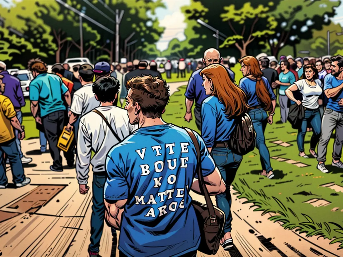
In one of the few studies on the usage of "red state" and "blue state," Benjamin Gross, a sociology and criminology professor at New York's St. Bonaventure University, analyzed newspapers' use of these terms between 2003 and 2007. Gross's paper suggested that readers might develop negative stereotypes of their fellow citizens based on the emergence of stereotypical behaviors and beliefs associated with "red state" or "blue state."
Whilst discussing CNN ahead of the 2024 election, over a decade after his research was published, Gross noted that these terms reflected a lack of mutual understanding and political nuance within an increasingly divided America. He added that by then, social media postings had further exacerbated this situation, stating: "If I were to analyze the use of 'red state' and 'blue state' on Twitter hashtags, I'd shudder at what I might find there... I think 'red state, blue state' has fallen into a deeply negative space where politicians and journalists discuss it more as a sociological fact."
According to Gross, these terms might fail to encapsulate the myriad of opinions that coexist within states, neighborhoods, and even individuals. After all, issues are rarely black or white, and neither are voters entirely red or blue.
"Missouri might appear as a conservative stronghold during elections, but areas like Kansas City and St. Louis are showing a significant liberal lean. This means that while it might seem like the Conservatives take the presidential victory, there's a substantial number of liberal voters in those regions. The concept of 'red states' and 'blue states' is often oversimplified, as you'll always find varying perspectives within any specific location. There's a multitude of individuals with liberal leanings even in what's typically considered a conservative region."
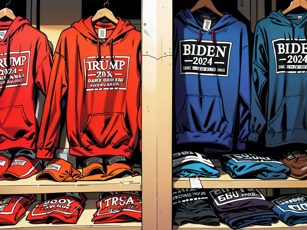
In the context of political affiliations, the Republican Party has historically been associated with the color blue, a connection that can be traced back to Abraham Lincoln's Union Army during the American Civil War, known for its dark blue uniforms. Furthermore, in the 20th century, as campaign branding became more sophisticated, the majority of Republican logos tended towards blue.
During the 1980 presidential election, ABC was the exception as they displayed the Republicans as red, a change from using yellow four years earlier. According to Brinkley, who was reporting for ABC at the time, they chose red due to its association with 'R' and Ronald Reagan.


